- CRO 1 2 3
- Posts
- How to Build Your Ecom Homepage
How to Build Your Ecom Homepage
+ Two 9-figure breakdowns
Harry Molyneux
August 19, 2024 • Estimated Reading Time: 6 minutes

B
Hey I’m Harry, and this is CRO 1 2 3 where each week I break down:
👉 1 Winning A/B test that added 5 figures
👉 2 Incredible e-commerce funnels
👉 3 Actionable Tips based on over 1,000 A/B tests our team has run whilst building 8-figure e-commerce stores
Today’s issue is packed with homepage CRO hacks.
My goal is to give you at least one idea that will increase revenue generated from any customer who visit the front page of your store (spoiler: that’s a lot of people).
If you’re not subscribed you can do so here:
Let’s get into it!
1 Winning A/B Test 🧪
I. Quick Navigation Menu
We added $72,507 of new incremental monthly revenue for an 8-figure DTC brand with this A/B test:

The Why:
We used Google Tag Manager to track clicks in the navigation menu over the course of a month to see where people were trying to go.
Click = interest
But not necessarily conversions
So we compared these clicks against the revenue of the corresponding collections, and found that these people were visiting areas of the site with low conversion rates.
It was huge drop-off, and a massive opportunity to improve.
Hypothesis:
Our hypothesis was that quickly displaying the highest converting collections in the site's header would help users visiting the homepage to find relevant products and therefore increase revenue.
And it did:

The changes lifted conversions by 4.30% and revenue per visitor by 3.35%.
That's $72,507 in new untapped monthly revenue.
A calculated $870k over a year!
(Note: demo store used for these images. (Our client has asked for his store to remain anonymous).
2 Homepages, Hacked 👨💻
I. Gym Shark
Next I want to show you how there is no one-size-fits-all approach to homepage layouts.
Take Gym Shark as an example.
They’re in the apparel niche with thousands of SKUs, so their top priority is product discovery and merchandising.
So instead of one big hero section at the top of the page as almost every store has, they have three of them stacked vertically.
This structure makes up almost the entire home page 👇


The focus is 100% on sending people to relevant collections or products. No fluff. They save the details for the PDP.
Love this.
II. Happy Mammoth
And now for a completely different approach
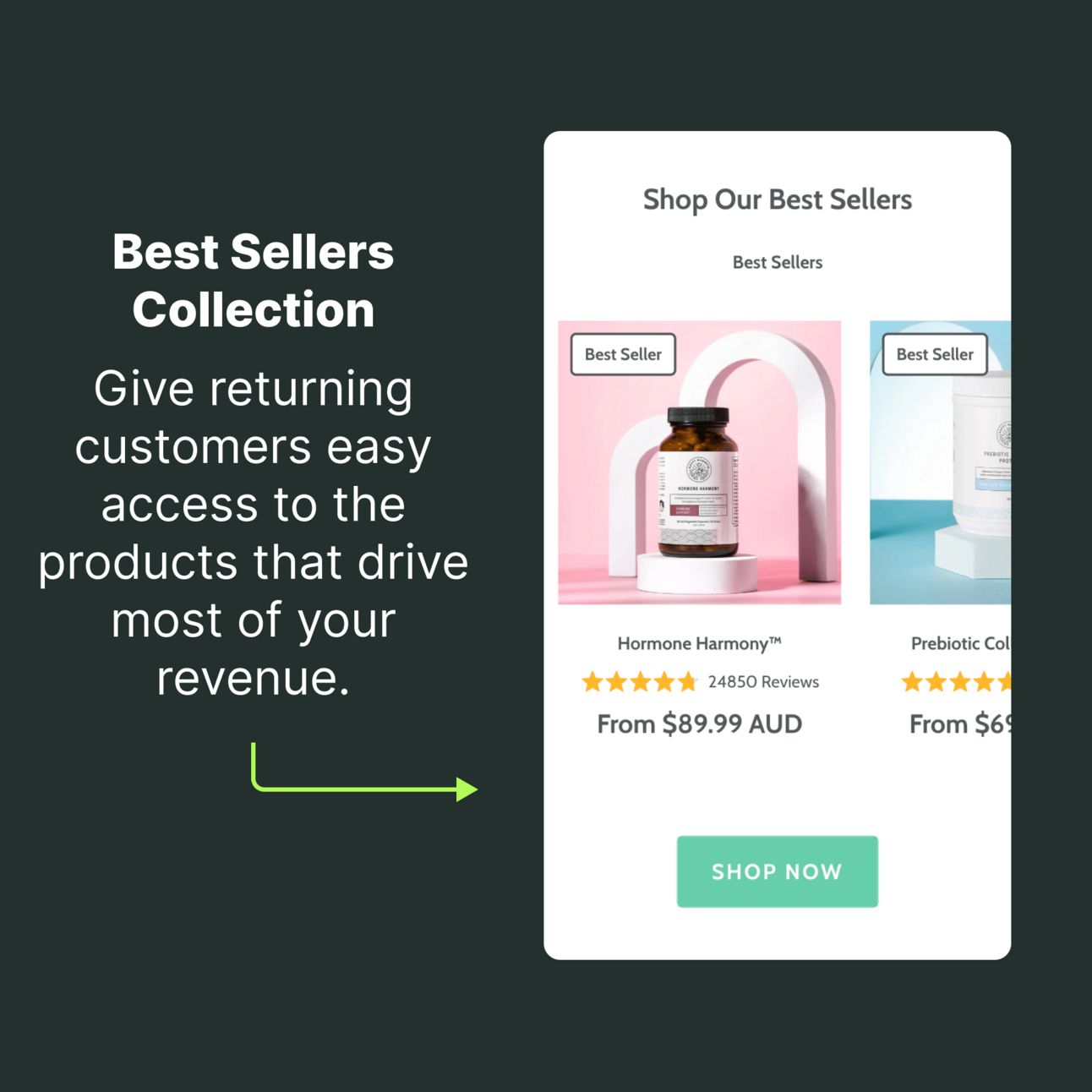
Our long-term client, Happy Mammoth, has a great homepage structure that’s built for different types of customers coming to their store, from skeptical first-time users to returning customers.
Here’s a breakdown of their homepage, section by section:


3 Learnings from 1,000+ eCommerce experiments 🔬
Finally, here are three quick-tips that you can use on your homepage:
I. Inject UGC Customer Stories
6/ Vertical Video
Crushing it on TikTok/Reels?
Try your winning content on the home and PDP.
I like app Videowise for this, but there are others.
Authentic reviews and non-sponsor-like posts are key. People crave honest opinions from real people.
On that topic...
— Harry Molyneux | CRO (@dtcpages)
4:00 PM • Jun 20, 2023
II. Use a founder story to show customers why your brand exists
🧪 CRO Case Study #52
We tested adding a founders story to a supplement brands landing page and measured a conversion rate lift of 4.90% and revenue per visitor increase of 4.87%
But why would we want to test this?...
— Harry Molyneux | CRO (@dtcpages)
5:00 PM • May 29, 2024
III. Use personalizations to show relevant homepage content to different visitor types
This surprised me
We're seeing great results by building unique home page heroes sections
And then ONLY showing them to new users.
This is how it works:
— Harry Molyneux | CRO (@dtcpages)
4:01 PM • Jul 28, 2022
Want to chat about how we can help you squeeze significantly more revenue from your ad spend?
Our team handles full-service CRO for brands like Jambys, Happy Mammoth, Laundry Sauce, and many more. If you’re running an 8 or 9 figure brand that could use a lift in website performance we want to chat with you.
If you read this email please to let me know by replying with a rating:
💎 = I didn’t like it
💎💎 = You’ve done better
💎💎💎 = Quite interesting
💎💎💎💎 = Very useful post
💎💎💎💎💎 = Great, more of this please!
If you have any homepage related questions, just reply and I’ll get back to you as soon as I can.
And if you know someone else in the DTC space who you think would be interested in tactical CRO advice then go ahead and forward them this email.
Until next time,
Harry Molyneux
Founder of CRO Agency, DTC Pages
Operator of Top Secret DTC Brand